Nexus AI is a scalable AI dashboard designed to simplify complex workflows and bring projects, AI usage, models, users, and activity into one clear workspace.
The experience focuses on strong information hierarchy, intuitive navigation, data visualization, and a reusable design system to help users quickly understand what’s happening while still having access to deeper insights when needed.
My role
Product Designer
Project Stage
Design Ready
Project Duration
1 month
Completed at
2026
Toolkit
Figma
The Challenge
Making complex AI workflows easier to manage
AI platforms can quickly become overwhelming as the number of projects, models, users, and generated content grows.
The challenge was to create a dashboard that could bring all of this information together without making the experience feel complicated or difficult to navigate.
The interface needed to give users a quick understanding of what was happening across their workspace, while still providing enough detail when they wanted to explore further.
The Solution
Creating a clear command center for AI workflows
I designed Nexus AI as a centralized workspace where users can monitor their projects, AI usage, models, users, and recent activity from a single place.
The experience was built around clear hierarchy and modular components, allowing important information to be understood at a glance while keeping deeper information accessible when needed.
The result is a dashboard that balances information density with a clean and focused interface.
Visual Direction
Building a focused visual language
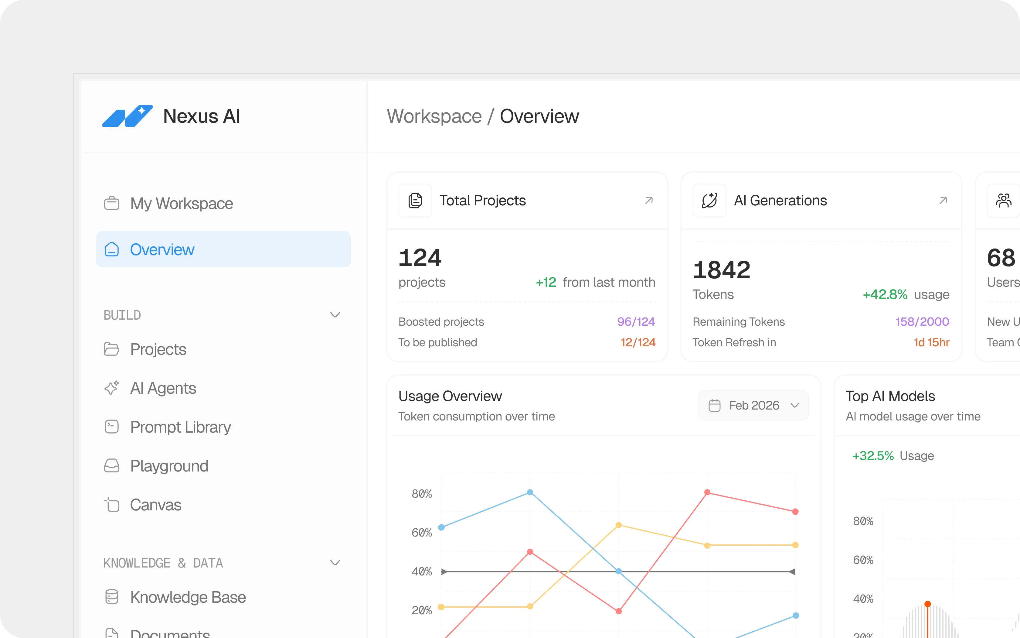
The visual direction was intentionally minimal, using a light interface and subtle borders to keep attention on the information rather than the interface itself.
Blue was used as the primary interaction color, while additional accent colors were introduced throughout charts, statistics, and status indicators to create visual distinction between different types of information.
Typography, spacing, icons, and components were kept consistent across the experience to create a system that feels cohesive rather than like a collection of individual screens.
Design System
Building a system that could scale
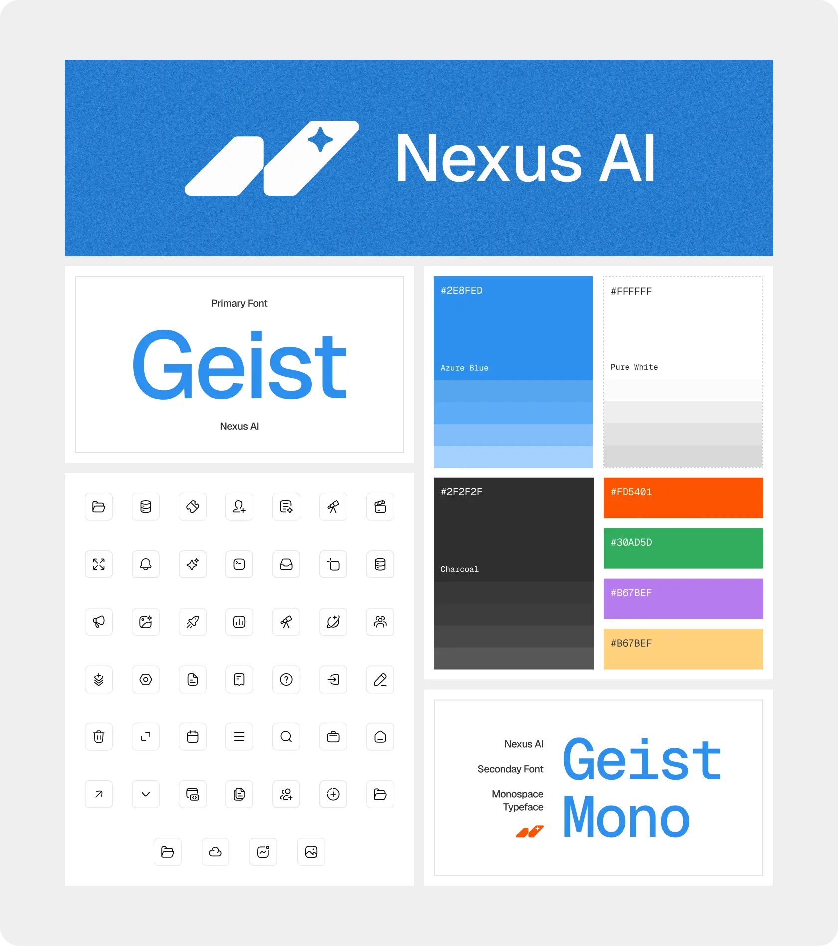
Rather than designing each part of the dashboard independently, I created a reusable visual system that could support different parts of the product.
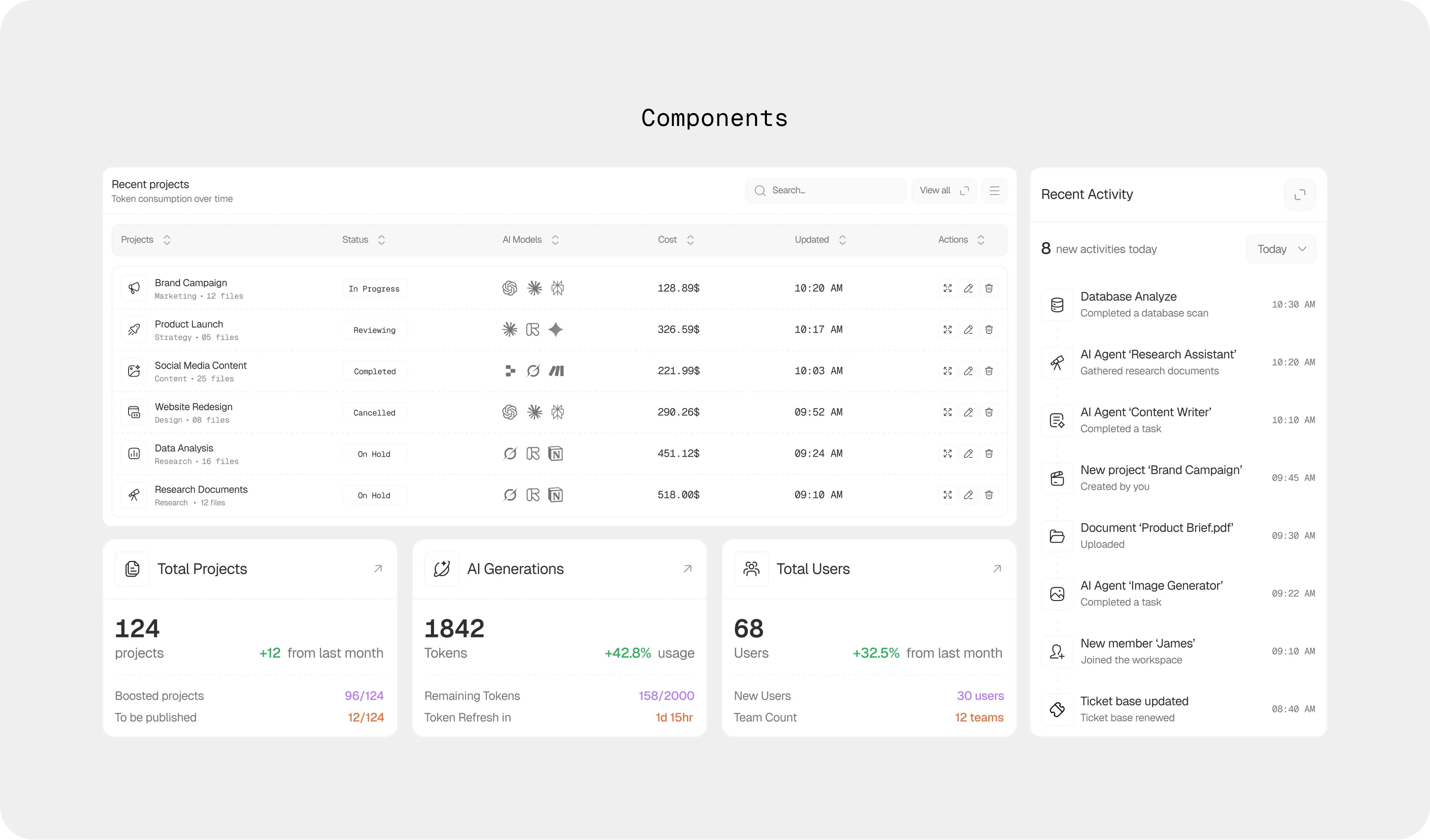
The system covers typography, colors, icons, buttons, inputs, cards, tables, navigation, status indicators, and data visualization components.
This allowed the interface to maintain consistency as new features and sections were introduced.
Information Architecture
Organizing information around the workspace
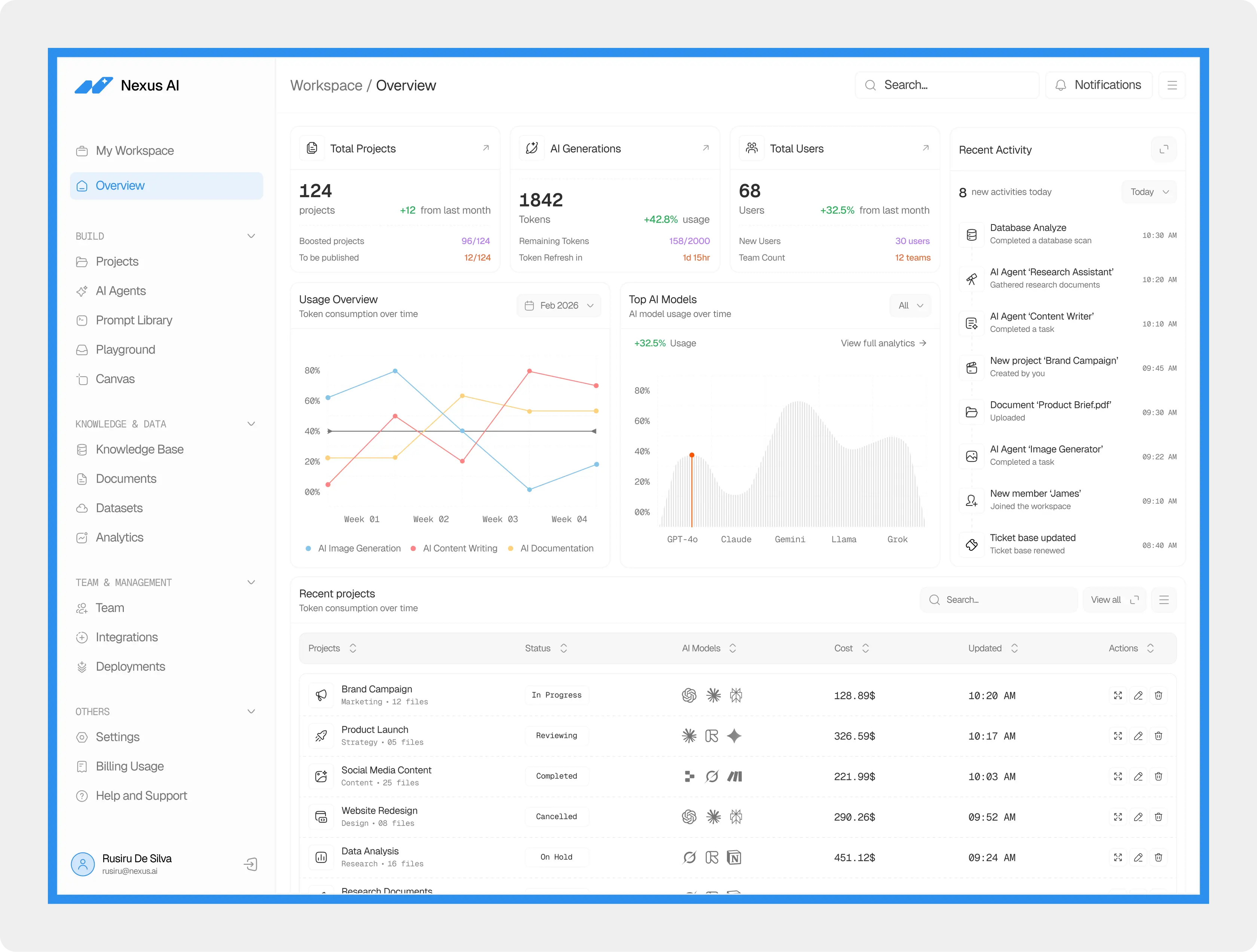
The dashboard was structured around the way users would naturally explore their workspace. The main navigation separates projects, AI agents, prompts, playgrounds, and canvas tools from knowledge, data, and team management.
The overview then brings the most important information together through key metrics, usage data, AI models, recent activity, and projects.
This creates a clear path from a high-level overview to more detailed areas of the product.
Data Visualization
Turning AI activity into something easy to read
AI products generate a large amount of data, but raw numbers alone don't always provide useful context. I used charts and visual comparisons to help users understand changes in usage, token consumption, model performance, and activity over time.
The visualizations were kept intentionally simple, with clear labels, restrained colors, and interactive tooltips that reveal additional information without adding visual clutter.
Interaction
Designing beyond the default state
A dashboard isn't only experienced through its static layout. I explored hover states and interactive feedback to make data easier to inspect and actions easier to understand.
Tooltips allow users to explore specific data points, while interactive elements provide additional context without requiring separate pages or additional navigation.
These small interactions help the interface feel more responsive while keeping the overall experience clean.

The Final Experience
A clearer way to understand an AI workspace
The final dashboard brings projects, AI generations, users, models, usage, and activity into one cohesive experience.
Instead of forcing users to search through different areas of the product to understand what is happening, the overview provides an immediate snapshot of the workspace while keeping deeper information within reach.
The result is a dashboard designed to make a complex AI product feel structured, predictable, and easy to navigate.
Reflection
Designing for clarity without removing complexity
Nexus AI was an exercise in finding the balance between information and simplicity.
The goal wasn't to remove complexity from the product, but to organize it in a way that makes the complexity easier to understand.
Working through the dashboard, components, data visualizations, and interaction states also reinforced the importance of designing systems rather than isolated screens.
The final result is a scalable foundation that can grow alongside the product while maintaining a consistent experience.
If you're looking for a designer who can take a project from concept and visual direction to a fully built digital experience, I'd love to talk.