Brutalis.m is a concept website for an architecture and interior design studio focused on creating spaces with character, warmth, and purpose. I designed and built the experience to feel like an extension of the studio itself minimal, immersive, and heavily driven by imagery, typography, and motion.
The goal was to move away from the typical architecture portfolio and create a digital experience that gives each project room to breathe while communicating the studio's design philosophy.
My role
Product Designer & Framer Developer
Project Stage
Design Ready
Project Duration
1 month
Completed at
2026
Toolkit
Figma Framer ChatGPT
The Challenge
How can an architecture website communicate more than just the projects?
The challenge was to create a digital experience that could showcase architecture and interior design while also communicating the atmosphere and character behind each space.
Instead of making another image-heavy portfolio, I wanted the website to feel like an extension of the studio structured, minimal, and intentional.
The solution was to build the experience around strong visual storytelling, typography, spacing, and subtle interactions, allowing the work to remain the focus while giving the studio its own distinct digital identity.
The Solution
Turning the studio's visual language into a digital experience
I approached the website as an extension of the studio's architecture, creating a visual system that could carry the same sense of structure and detail into the digital space.
The design combines a strong editorial layout, bold typography, immersive project imagery, and purposeful interactions to guide users through the studio's work without competing with it.
From the branding and UI to the final Framer build, every part of the experience was designed to feel connected creating a website that is visually distinctive while remaining simple to explore.
Visual Direction
Finding the visual language
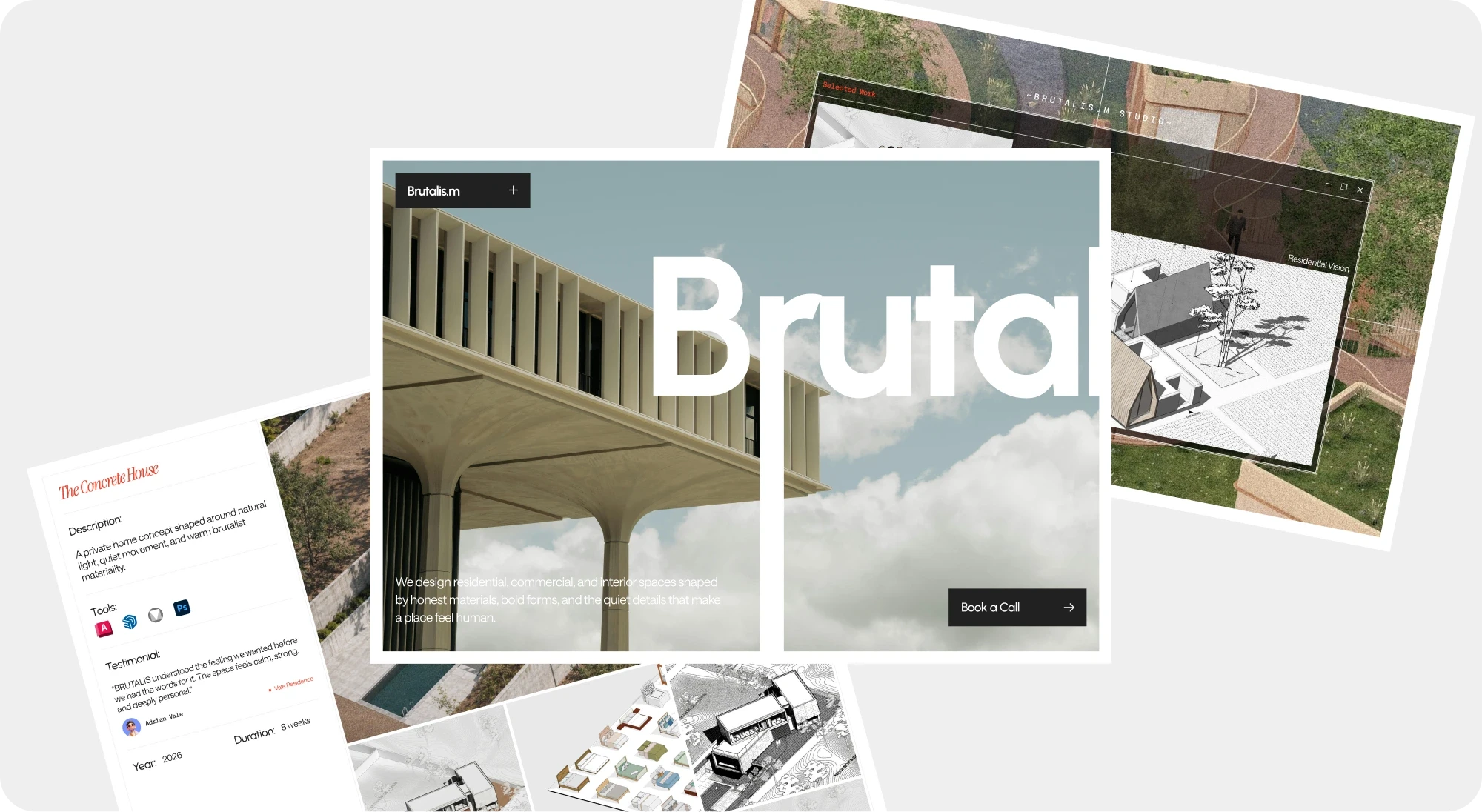
I started by exploring how the studio's architectural character could translate into a digital experience. I looked at architecture references, editorial layouts, typography, materials, and contemporary studio websites to establish the overall direction.
The visual language gradually came together around a balance of boldness and restraint strong type, structured layouts, generous negative space, and imagery that takes center stage.
This direction became the foundation for the branding, UI, and interactions that followed.
Design System
Building an identity around the architecture
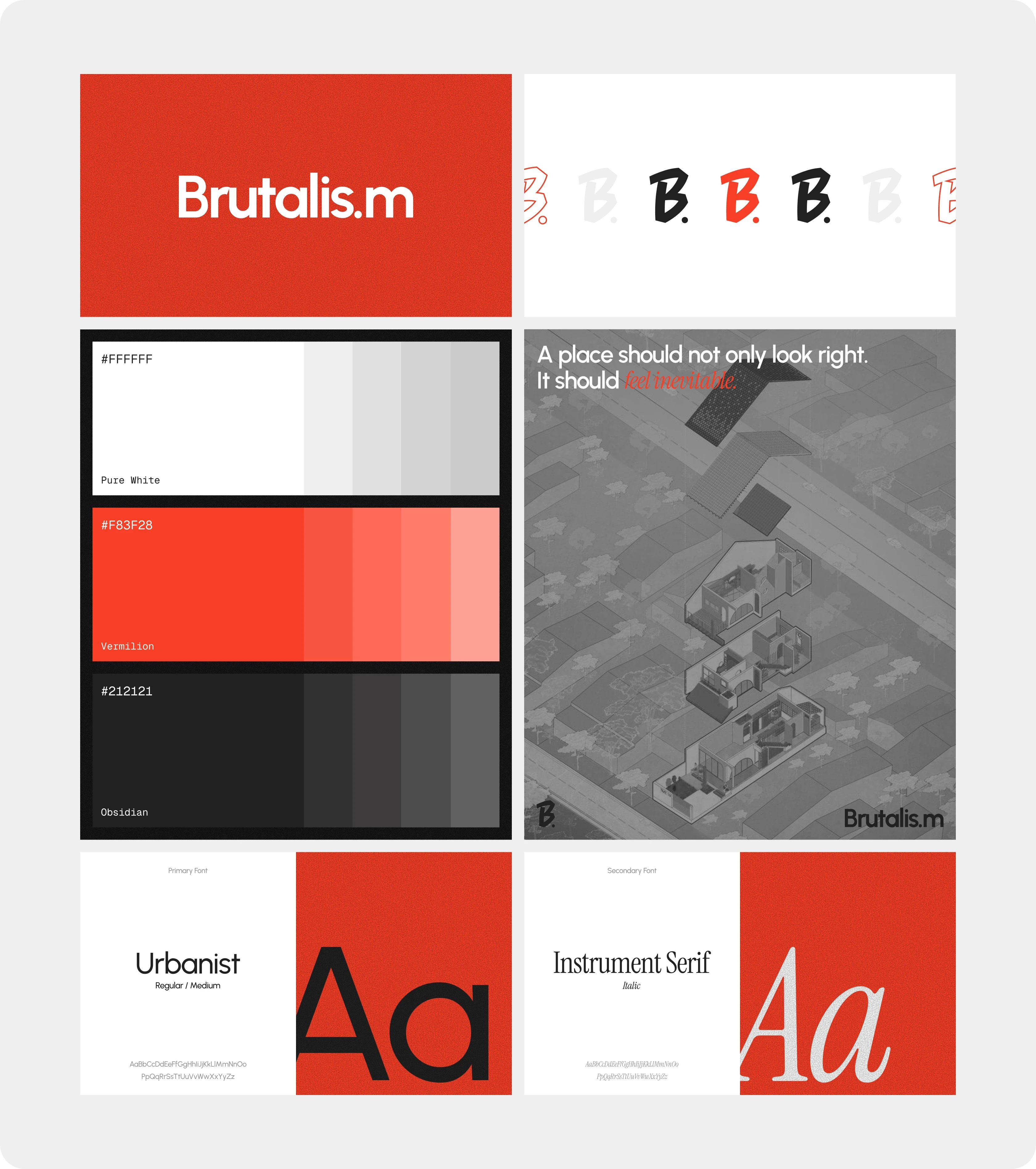
The branding was designed to feel like a natural extension of the studio's work rather than something separate from it.
I explored different approaches to the logo, typography, and visual details, looking for a balance between raw architectural character and a more refined editorial feel.
The final identity keeps things intentionally minimal, allowing the type and logo to work alongside the architecture rather than compete with it.
UI Design
Bringing the identity into the interface
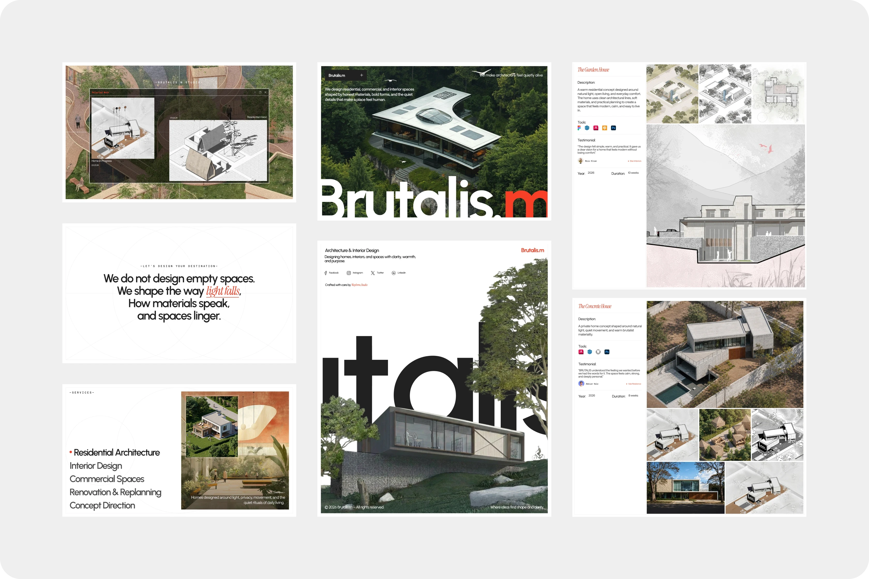
With the visual direction established, I translated the identity into a flexible interface that could work across the different parts of the website.
The focus was on clear hierarchy, strong imagery, and generous spacing, allowing the projects to remain the main focus while keeping the experience easy to navigate.
I designed the key screens and responsive layouts in Figma, refining the details across the homepage, project pages, navigation, and supporting sections.
Development
From Figma to Framer
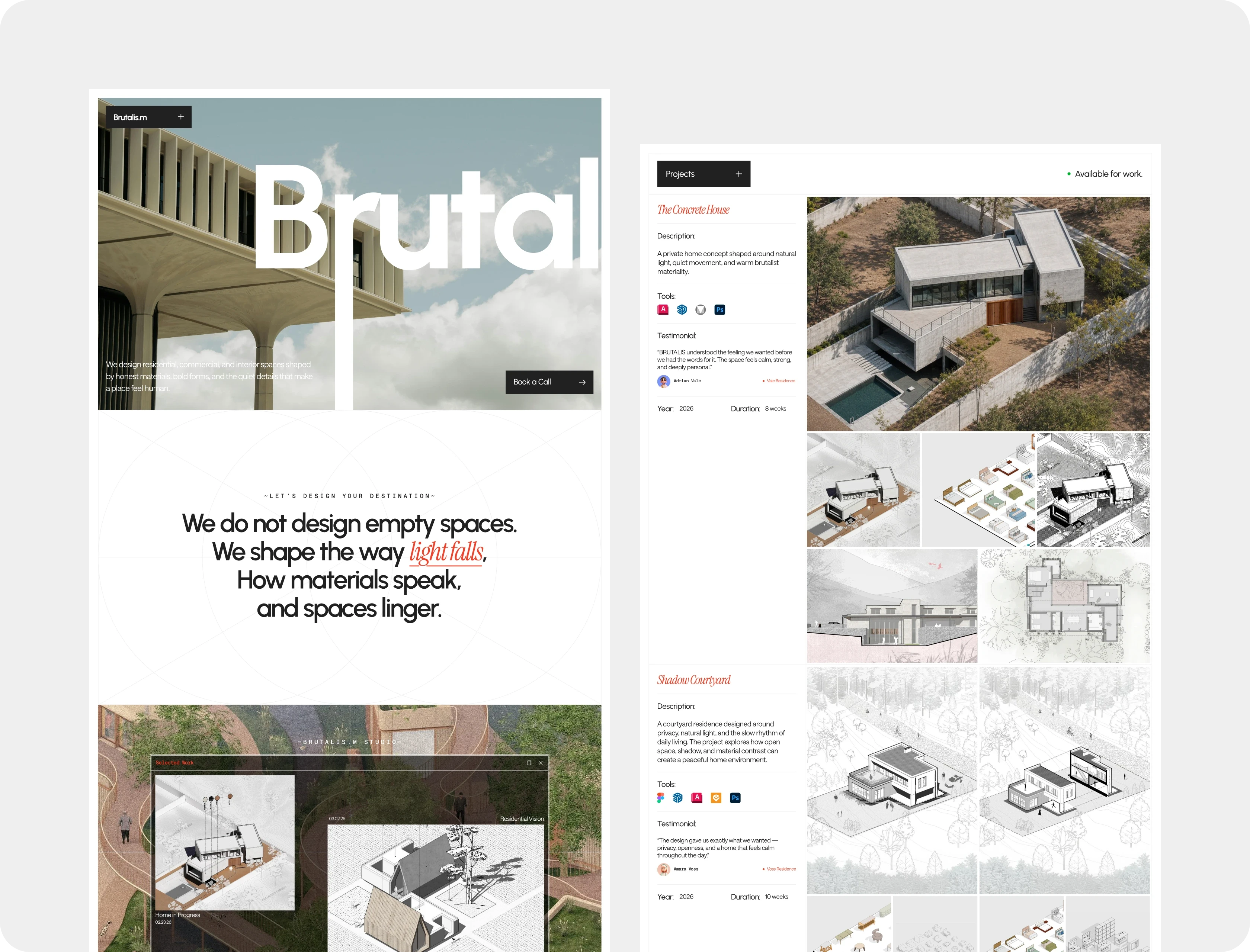
Once the visual system and interface were established, I brought the designs to life in Framer.
Because I handled both the design and development, I could refine the experience while building it rather than treating development as a separate step. I created reusable sections, adapted layouts for different screen sizes, and fine-tuned interactions directly in the browser.
I also used ChatGPT as part of the development process for exploring implementation approaches, troubleshooting, and speeding up repetitive tasks, while keeping the final design and decisions under my control.
Reflection
What I took away
Brutalis.m gave me the opportunity to work across the entire digital experience, from visual direction and branding to UI design, interaction, and development.
One of the biggest takeaways was learning how much consistency matters when a project relies heavily on visuals. Small decisions around typography, spacing, imagery, and motion can completely change how the final experience feels.
Building the site in Framer also allowed me to stay close to the design throughout development and refine ideas as they came to life.
If you're looking for a designer who can take a project from concept and visual direction to a fully built digital experience, I'd love to talk.